The image below shows "35mm Photo Technique" by H.S. Newcombe, a photography technique book first published in 1946. It was a whimsical purchase from a second hand store, after having the plates for depth of field catch my eye. My copy is the fourteenth edition, from 1960. It's a delight.
This photo of the cover doesn't show well the giant embossed "35" that the book sports.
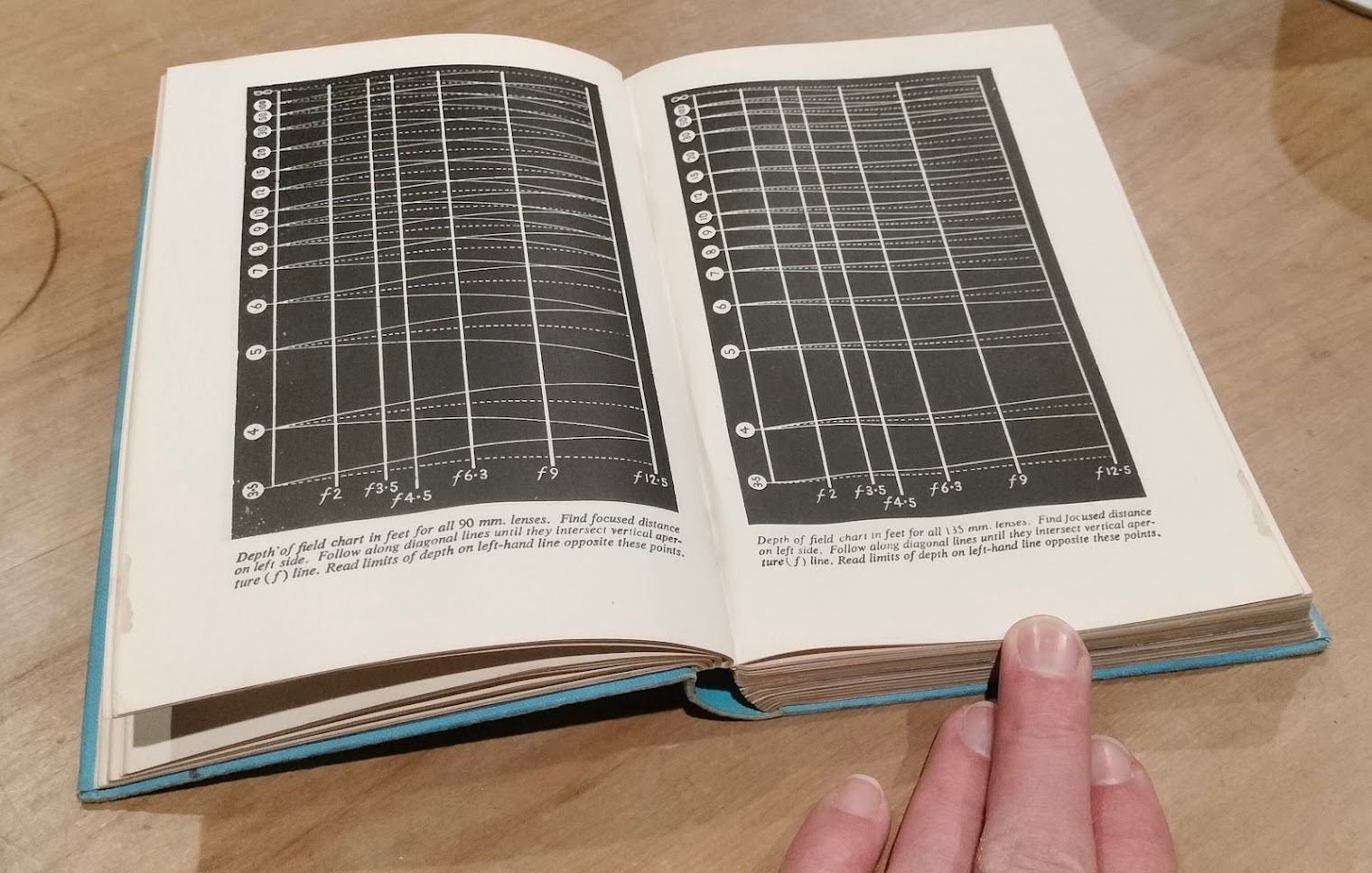
The plates which first caught my eye in the store were the depth of field charts for various lense sizes - several pages of dense black ink with reversed white lines on paper.
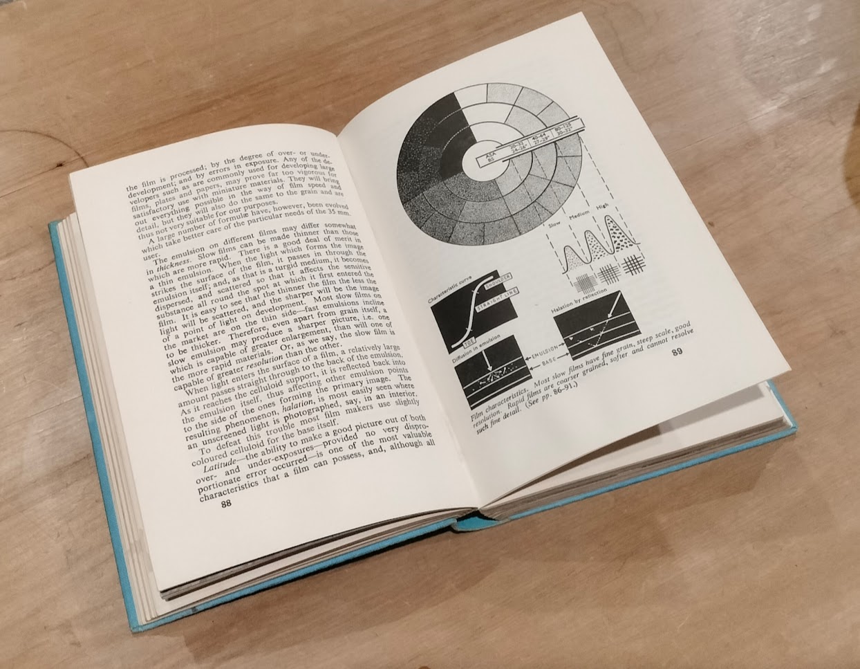
There's rich information through the book, presented clearly and at a good level of amateur technical detail, sufficiently that it's very relevant to using a film camera today. For a book first printed in 1946, I find its relevance and utility in 2024 impressive. The technology of film is explained clearly and in ways that I find reveal a clear explanation.
For example, while using cameras recently I had been trying to envisage how an accurately timed exposure of up to 1/1000th of a second could be constructed using mechanical components in such a small space. The descriptions of various shutter mechanisms (pp 25-31) do a great job of outlining several common implementations in ways that I can understand by reading and thinking about the underlying technology. It's delightful and educating.
Anyway. I'm a bit in love with this book visually, and I decided it would be nice to use as the inspiration to style this site. Until now the site has been whatever the default look of a Tailwind CSS site is - and that didn't feel like much of a contribution. So!
Newcombe 35 is the style of this website
First things first: I'm no typographer. This probably won't look polished. It also probably won't look much like the printed book, since this is a website. My style of writing is far less dense - I use plenty of single-sentence paragraphs, H. S. Newcombe didn't have emoji at his disposal, there's no fixed paper size ... it's very much an "inspired by ..." thing I'm doing here. This design deviates substantially.
I've selected three fonts currently, all free fonts provided by The League of Movable Type (go check them out):
- Ostrich Sans for the title, navigation etc - similar to the typography of the author and press name on the book cover; the exterior branding.
- League Spartan for section headings and the "table of contents" on the front page
- Fanwood for body text
I've implemented this where possible by customising the existing Tailwind-based theme I was using. I've used Tailwind on a few projects, but largely as a way to avoid doing much theming, by accepting a base design that was good enough. I'm finding it works OK, with a definite balance of making some basic things (line height and text width overrides) slightly less direct, then finding that the rest of the design tends to hold together well as a result.
A good time to ask myself then: Am I sold on Tailwind? It's ... working out, I guess. I do feel like I'm flying under the envelope of where Tailwind might pay off - if you had a team of designers and needed to keep a coherent alignment with lots of moving components. That's definitely not a problem I face here!